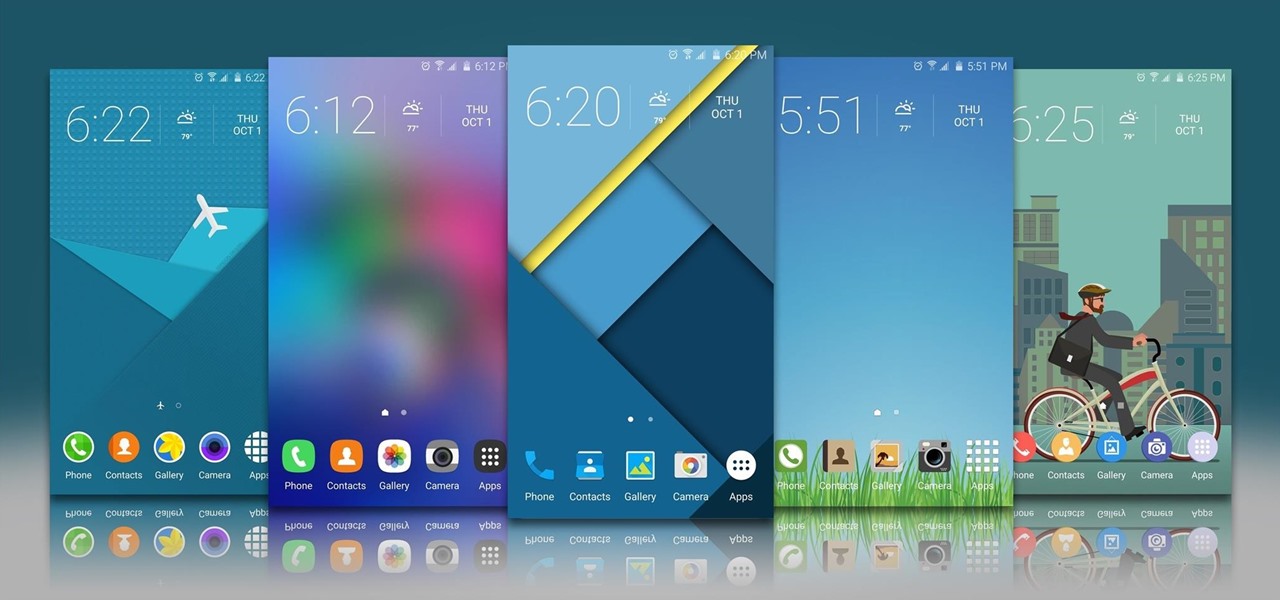

Taste is certainly relative. When you look at Central American architecture and notice all of the bright pastel colors, then move just a thousand or so miles to the north and see that buildings in the United States are mostly painted in earth tones, this becomes abundantly clear. Imagine if you were to switch hemispheres altogether—what would you see in East Asia?
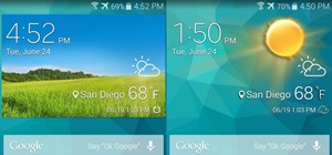
With Samsung being a Korean company, it only makes sense that the majority of themes offered for their latest line of Galaxy smartphones cater to Korean tastes. Western tastes obviously differ, so many of these themes come across as garish to our eyes. Nonetheless, there are still quite a few "good-looking" themes available for the Galaxy S6, S6 Edge, S6 Edge+, and Note 5 that will give your phone a visual style that suits your tastes.
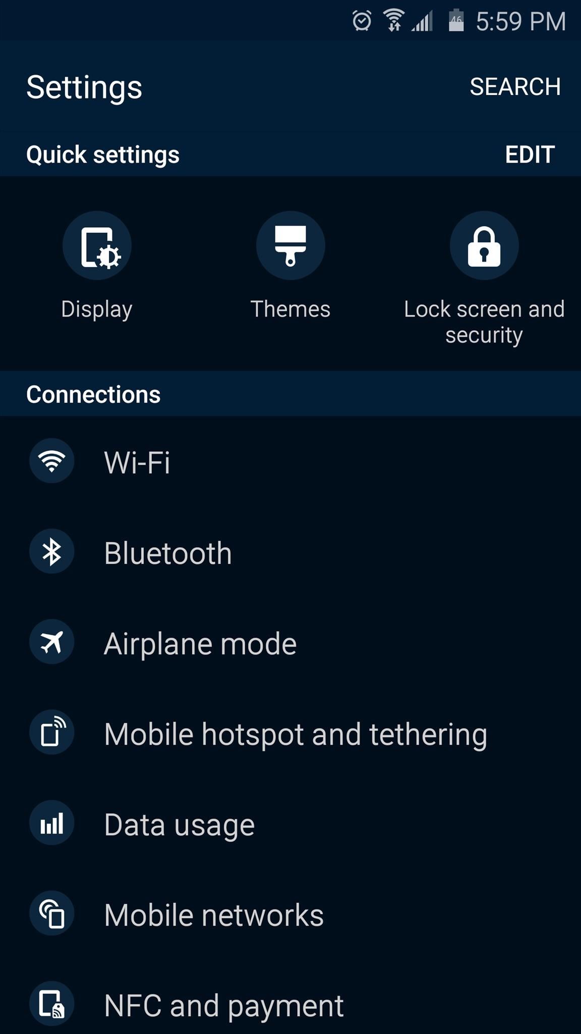
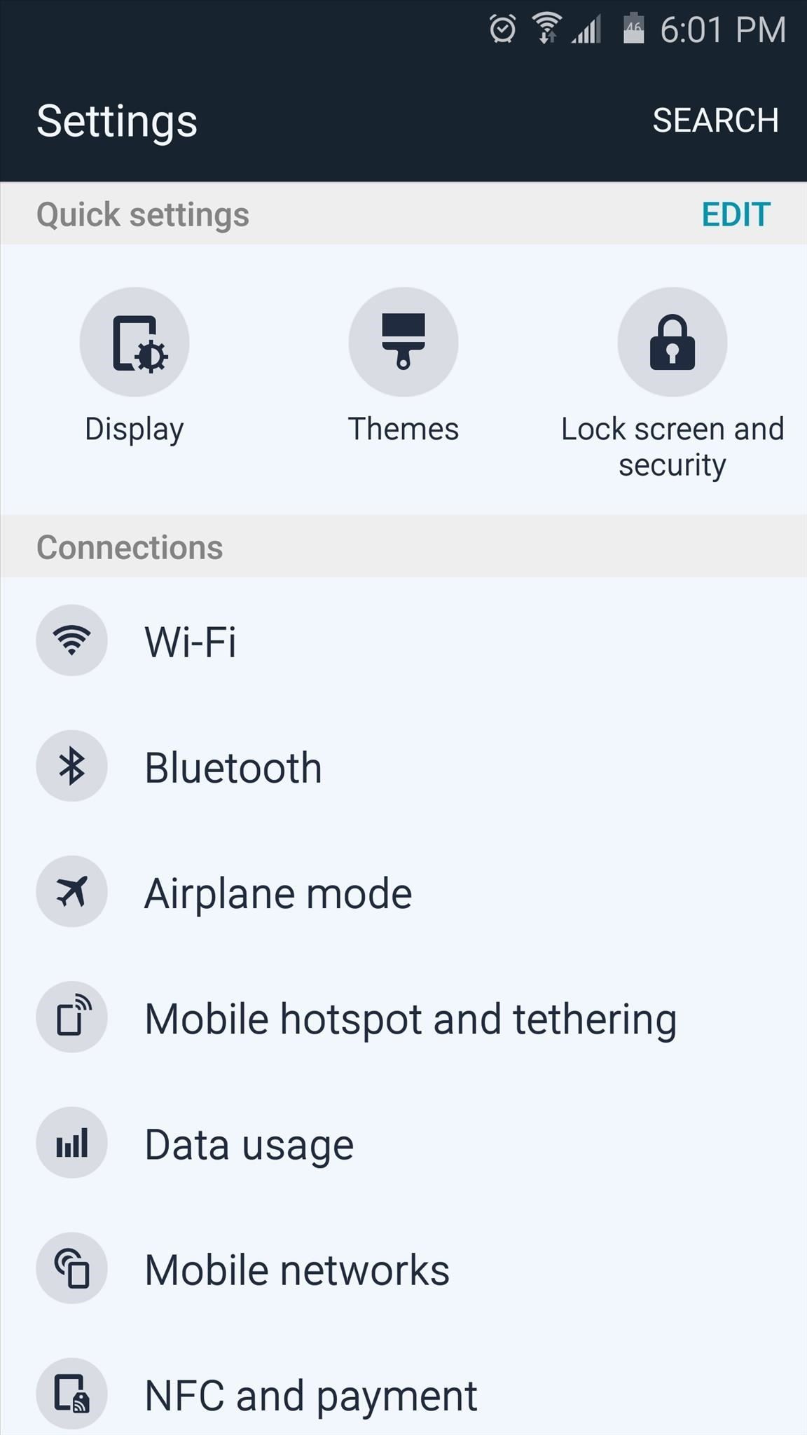
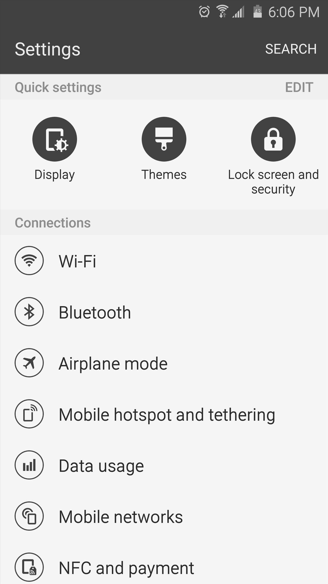
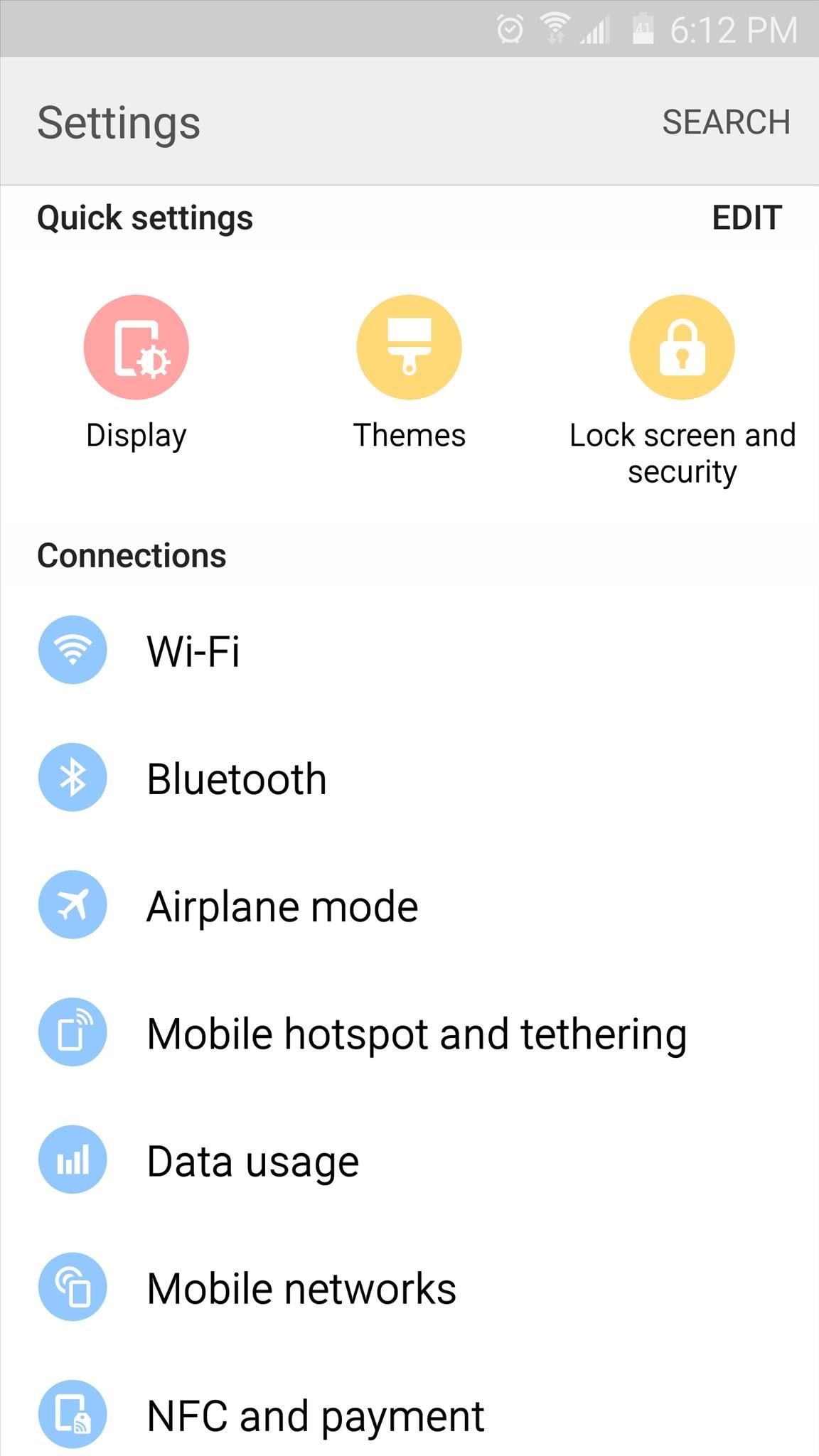
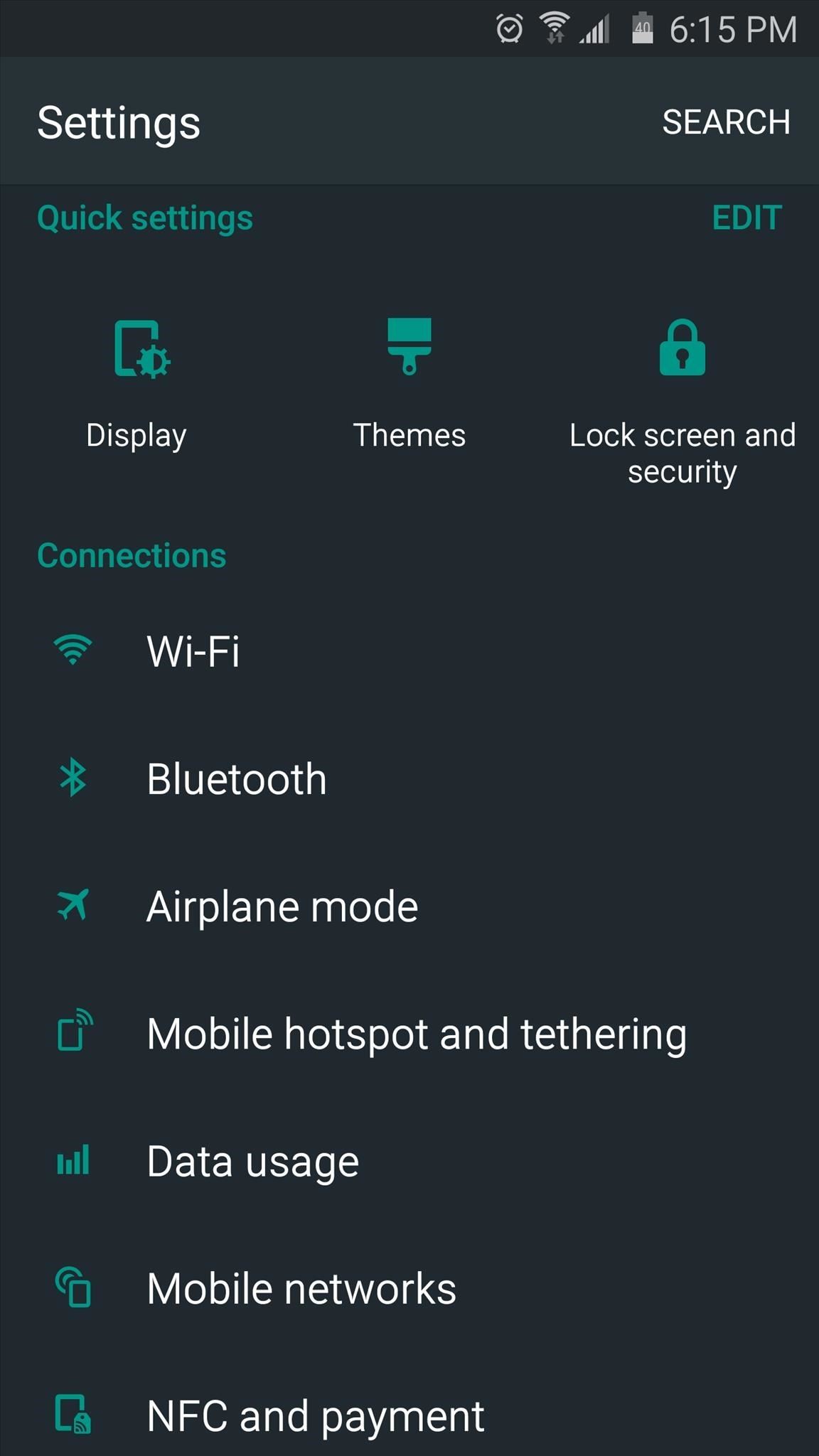
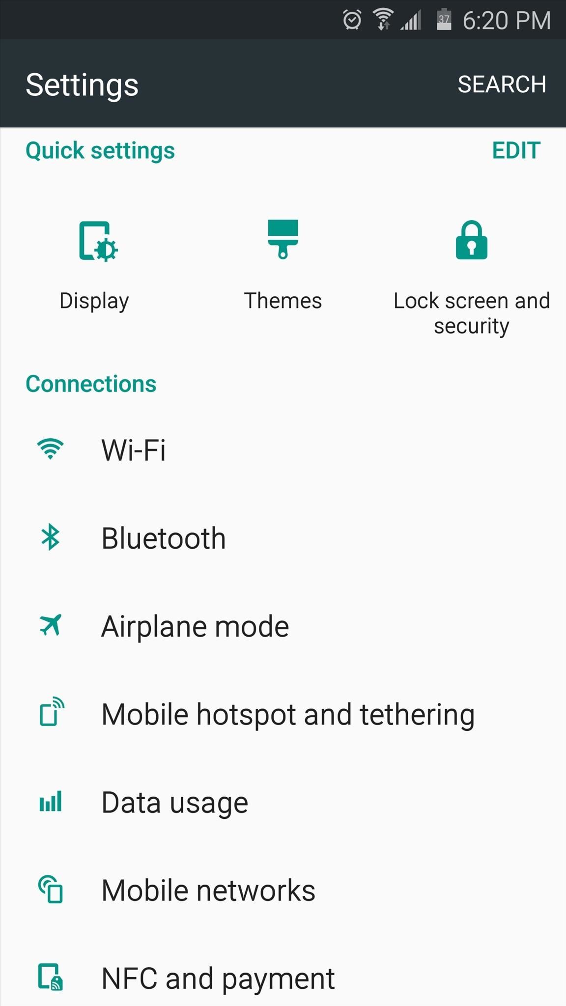
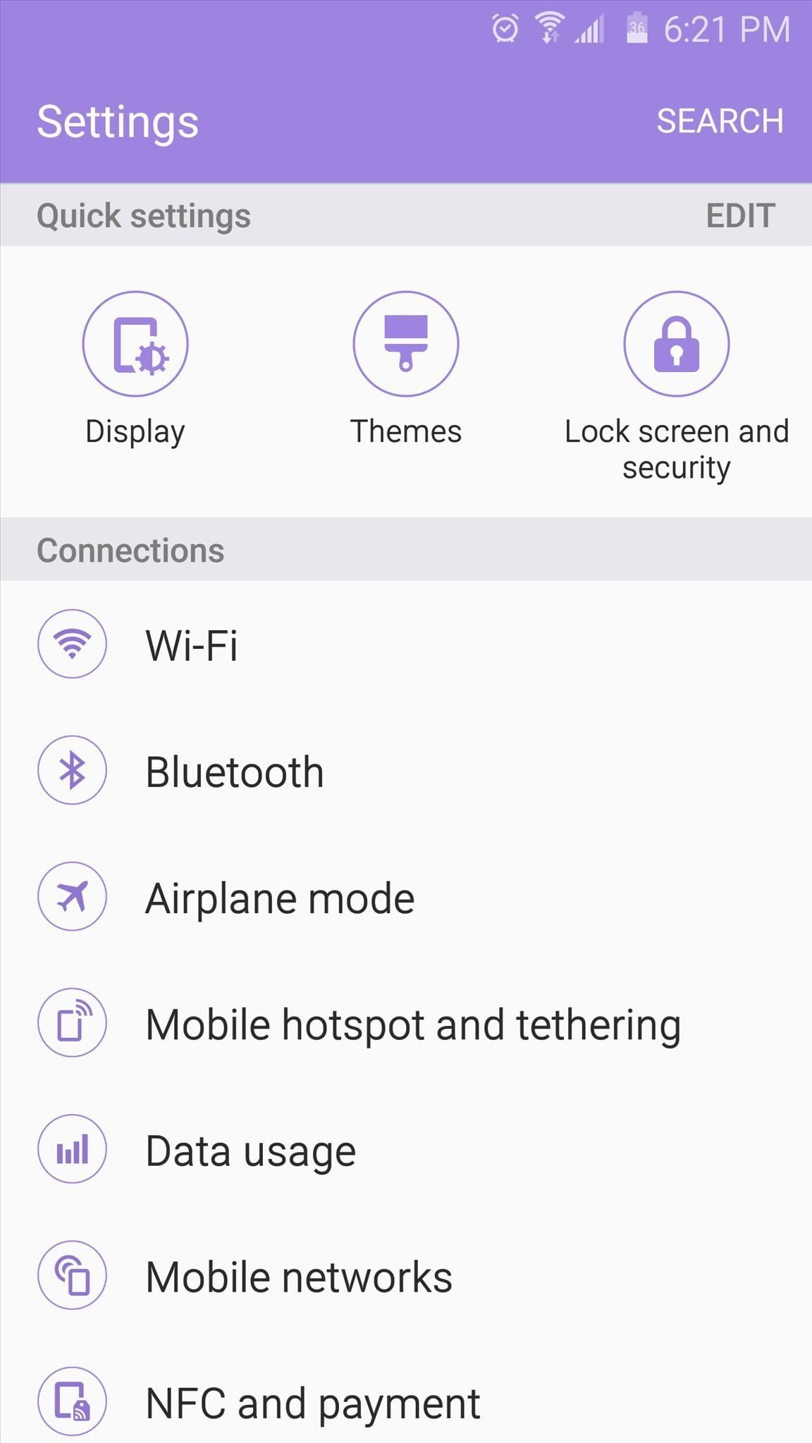
How to Find These Themes
Unfortunately, Samsung doesn't allow link sharing for any of their themes, so I can't give you direct links to the install pages. But since each of these themes are free, they should still be fairly easy to find.
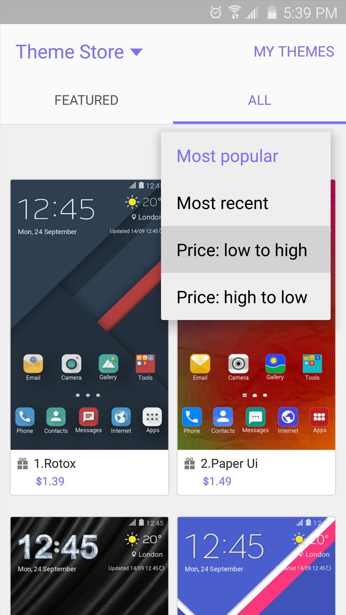
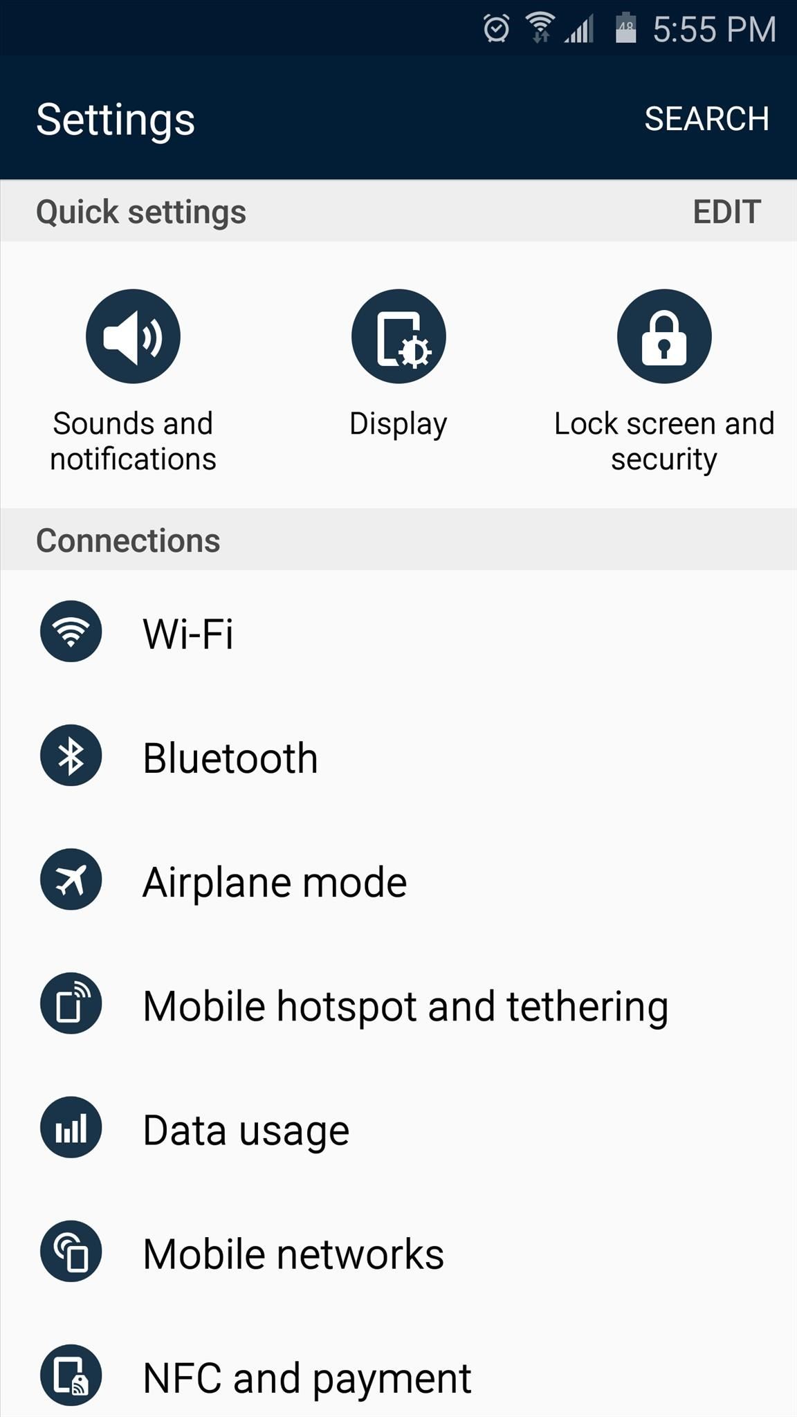
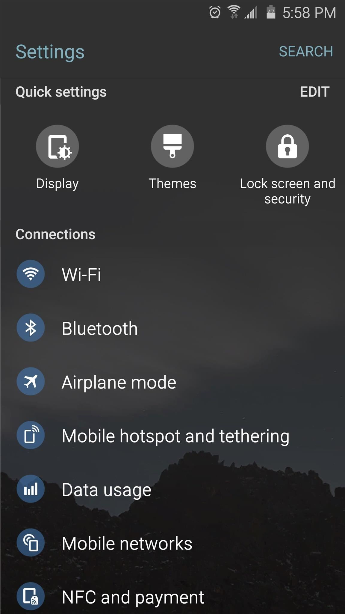
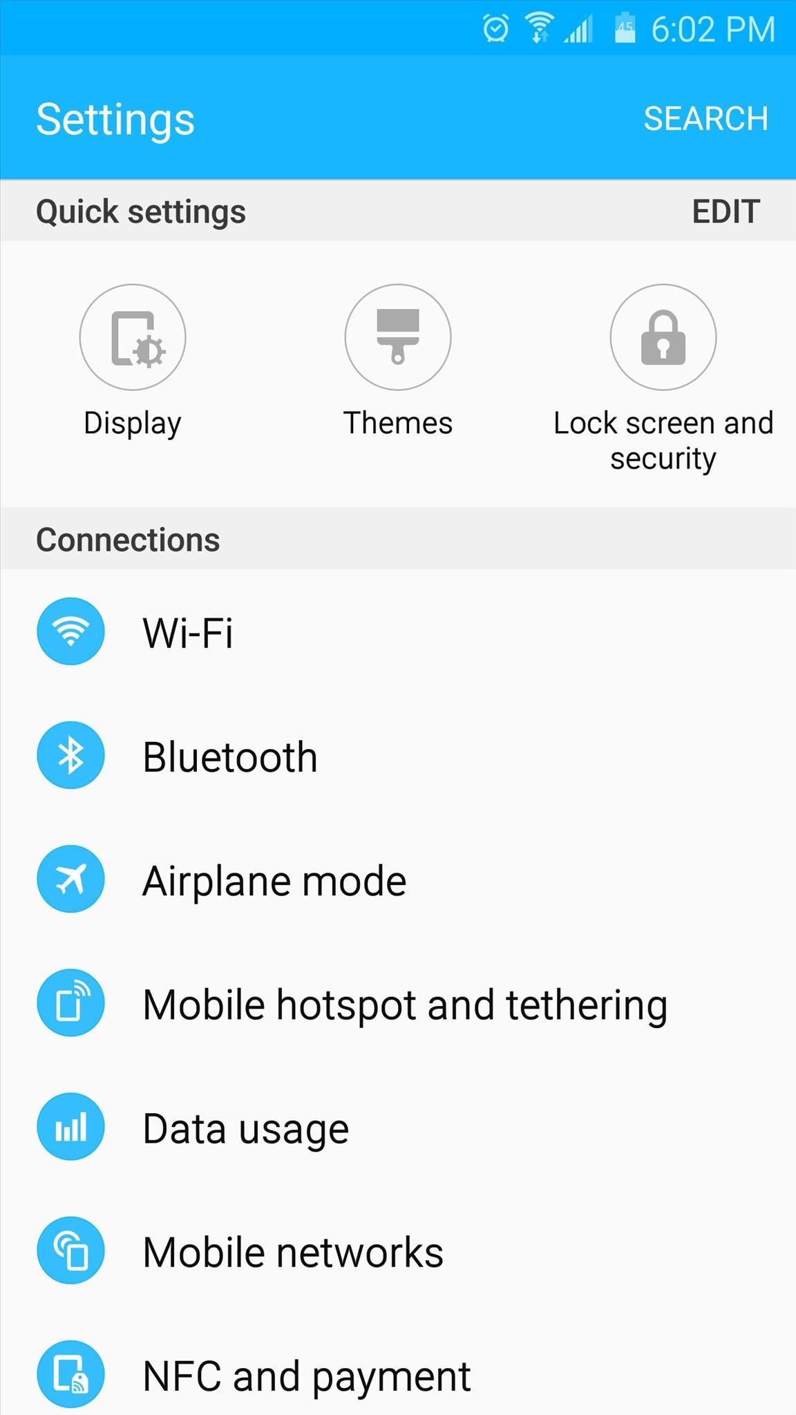
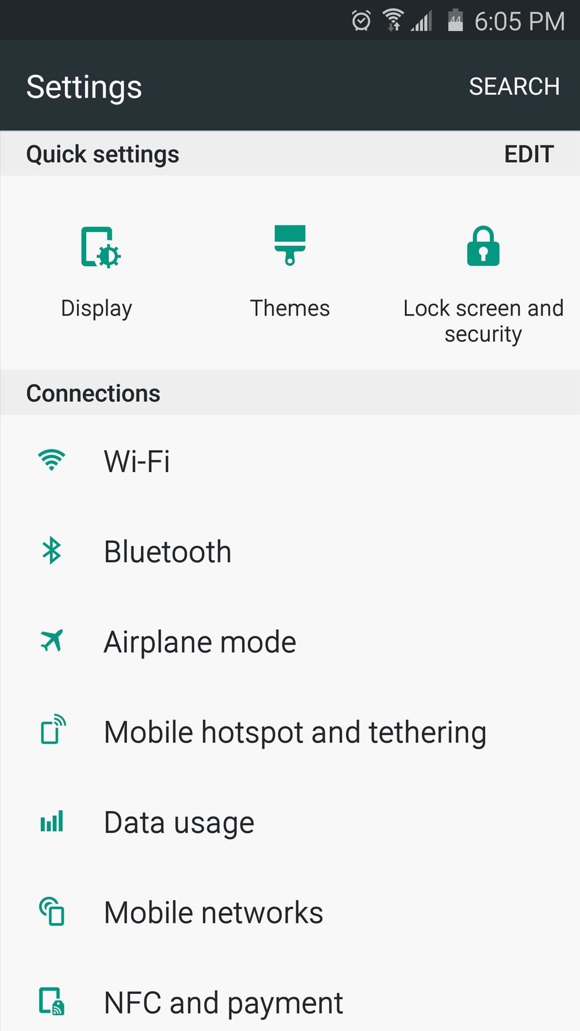
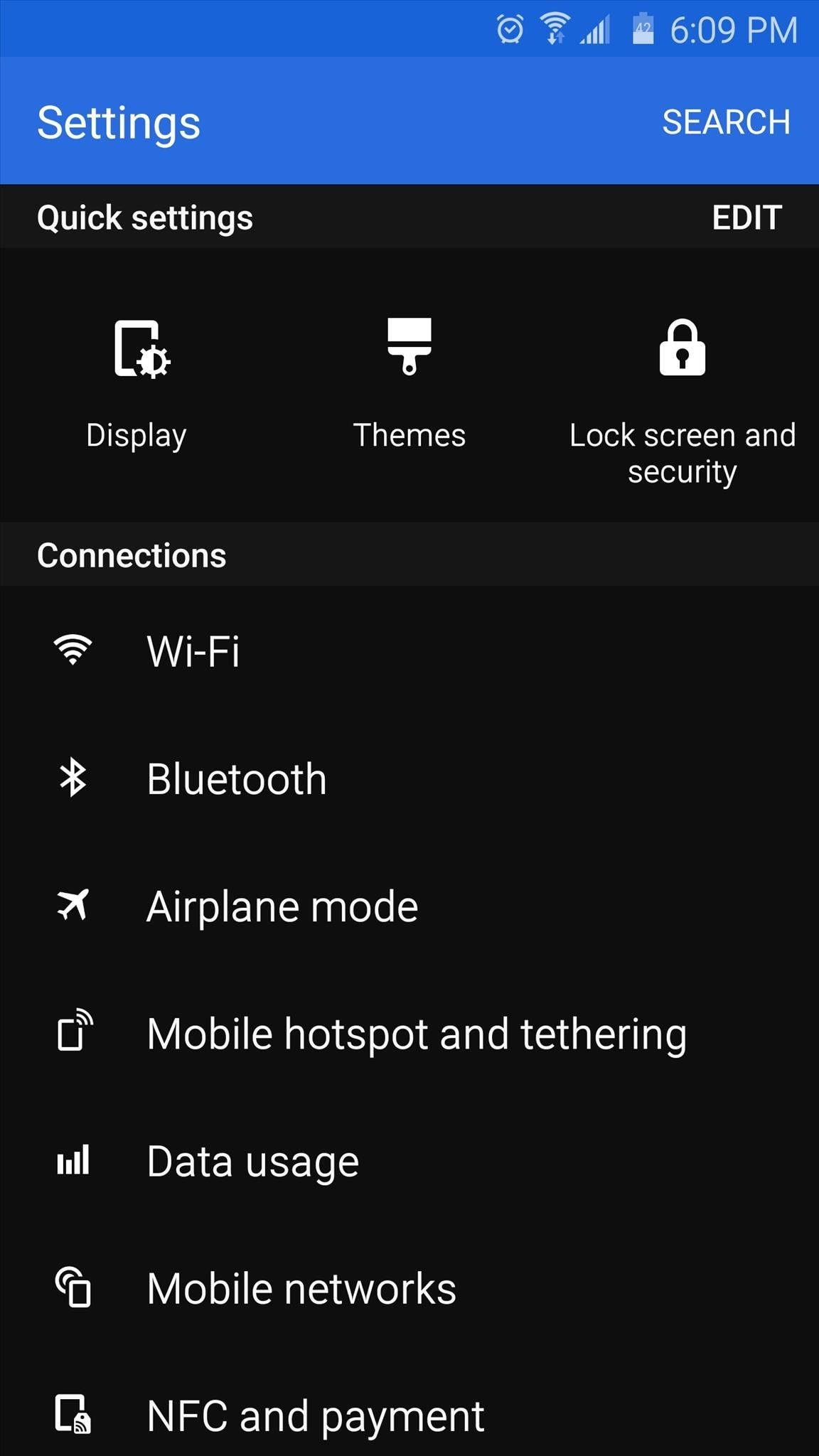
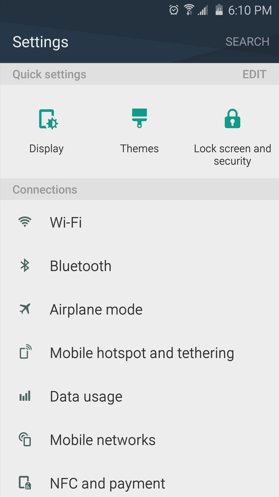
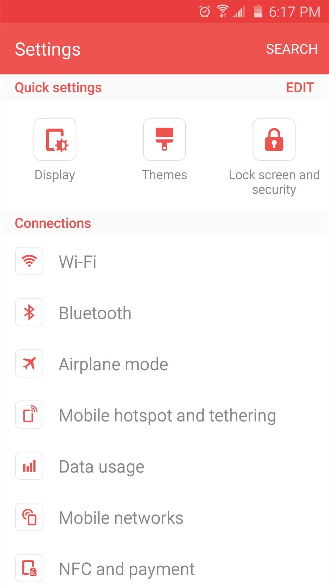
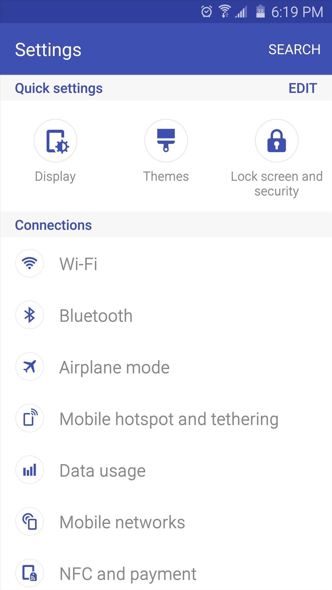
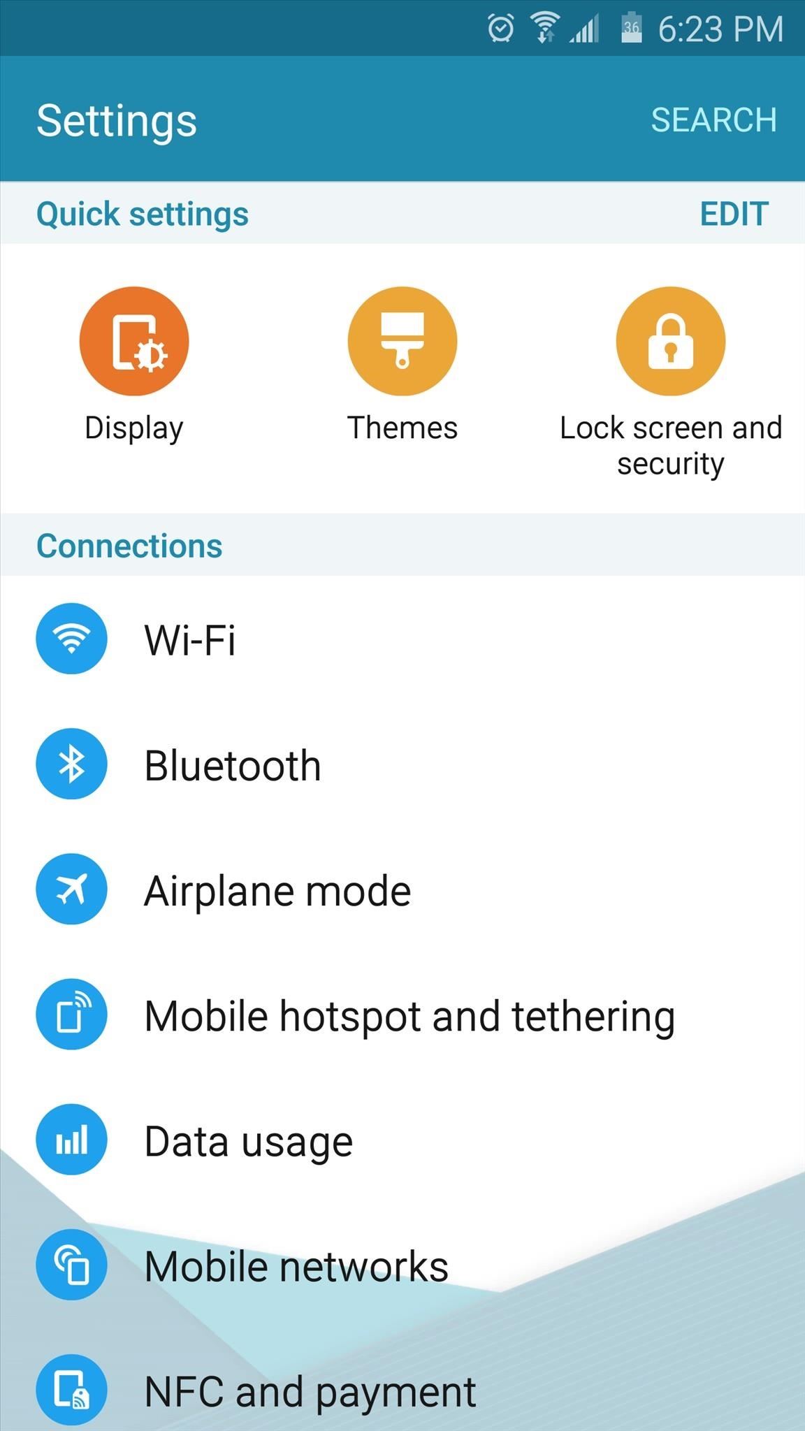
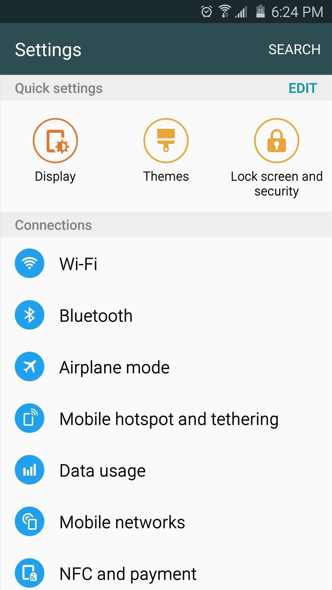
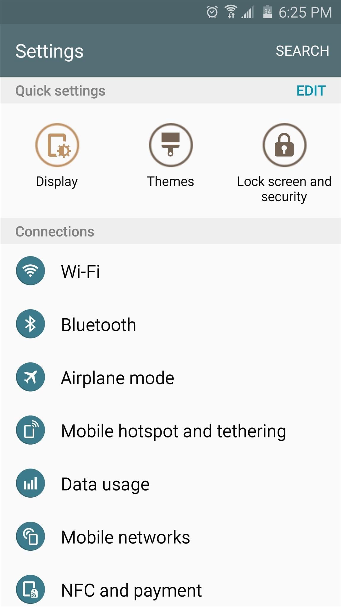
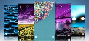
To begin, head to the Themes entry in Settings, then tap the "Theme Store" button at the bottom of the screen. From here, swipe over to the All tab, then use the drop-down menu near the top of the page to sort by "Price: low to high." The themes in this article will be listed in the order you find them here, and each section below is labeled with the theme's exact name.

1. Clarity
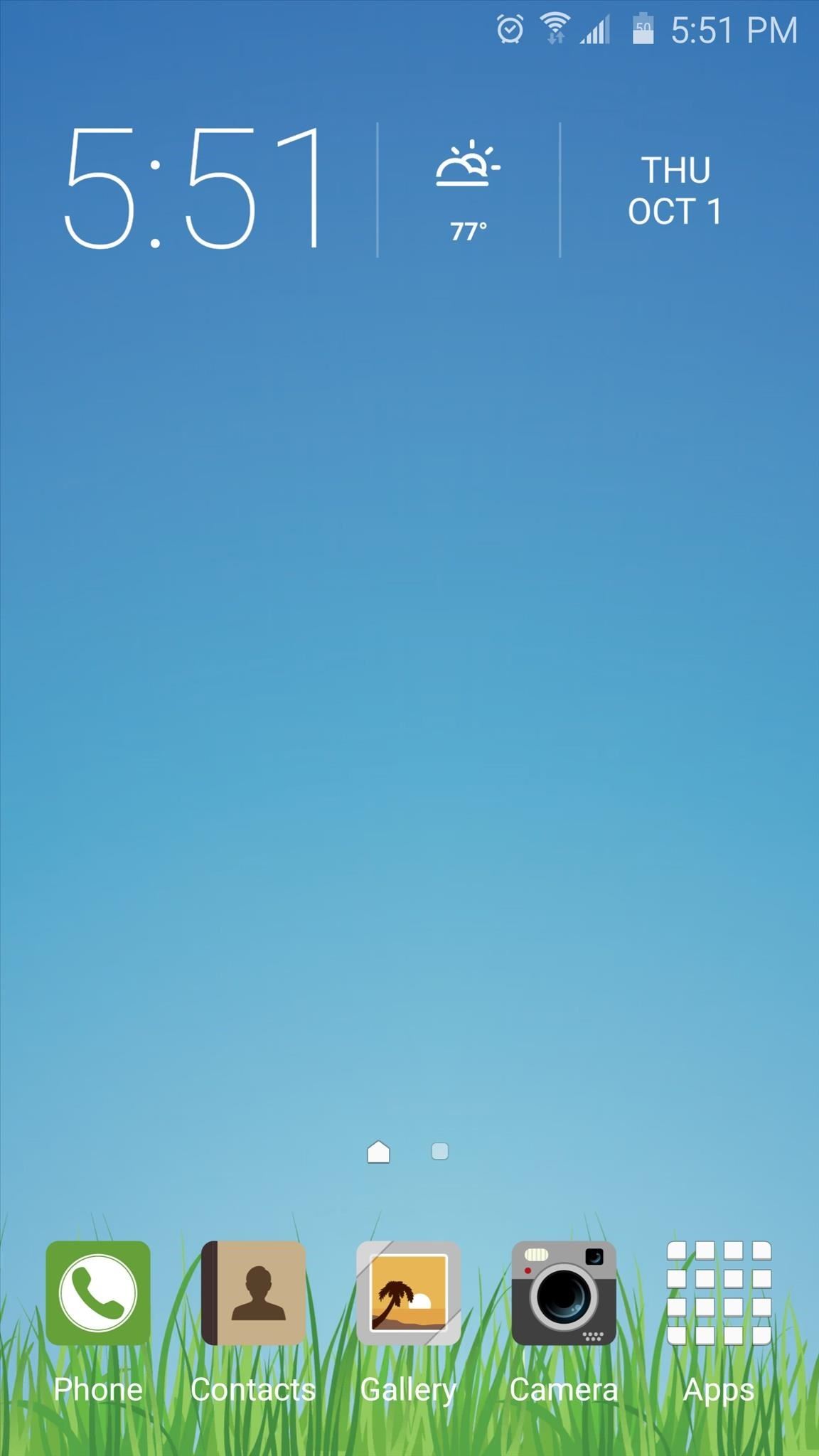
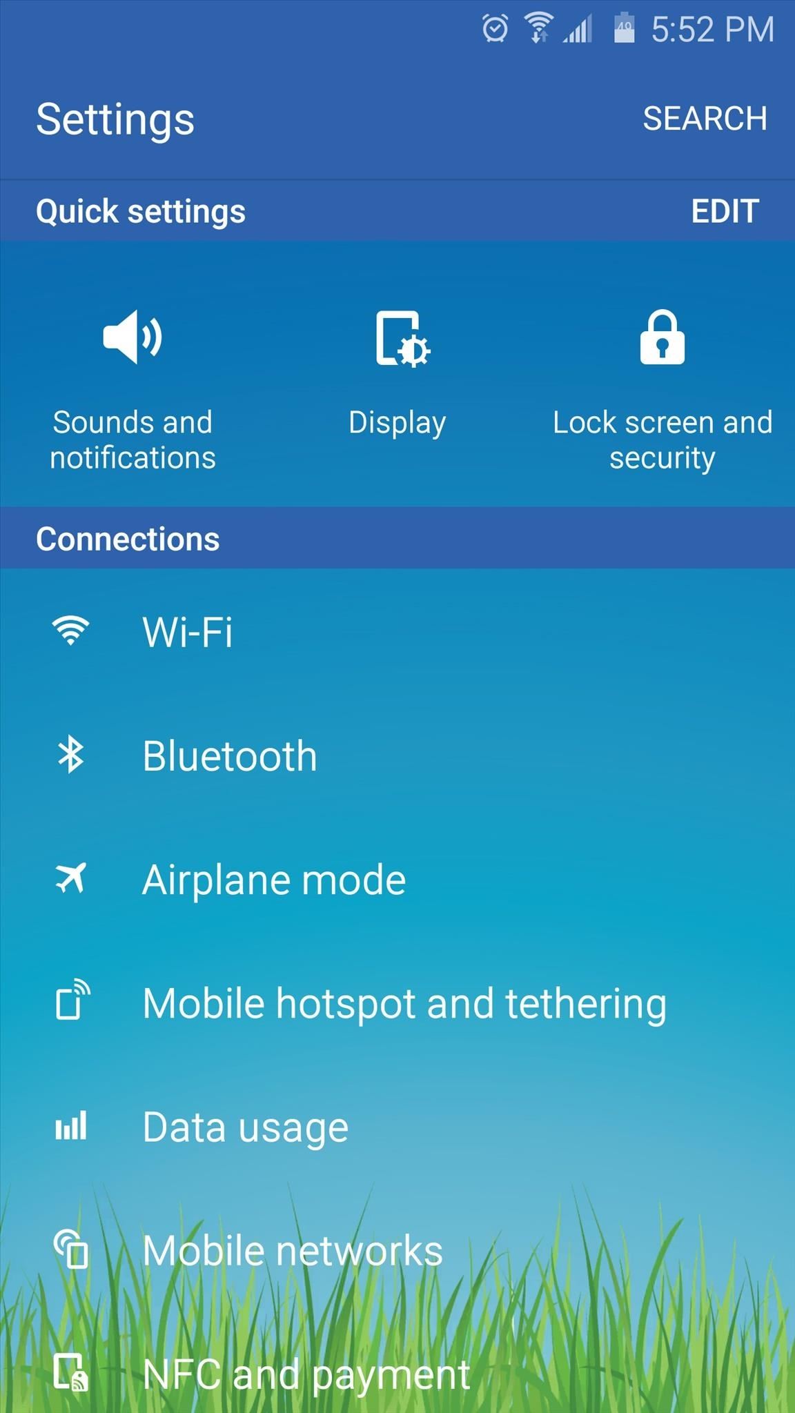
Speaking of earth tones, this first theme centers around the colors of sky and grass. As with all of these themes, the default wallpaper can be changed, but you'll still notice the serene meadow scene serving as a backdrop to some apps like the Settings menu.
2. (MINU)Zero White
If you like your smartphone's interface to be high contrast with subtle coloring, Zero White might be the theme for you. The theme gets its name from its predominantly white backgrounds with darker text and icons, but a few cyan accents here and there don't distract from the minimalist look.
3. Hope.
This next theme uses faded colors and a rounded-square look for its icons, but the rest of the interface elements are perhaps even more subtle. Blurred and darkened landscape photos serve as the backdrop for most menus, and the system interface is notably understated.
4. (MINU)Zero Dark
Zero Dark is like Zero Light's evil twin. It's from the same developer, so the icons and accent colors are very similar to the second entry in our list, but most system menus have a black backdrop with white typeface instead.
5. Night
With a name like "Night," you'd think this theme would be overbearingly dark, but the developer has found a way to tastefully mix in some lighter backgrounds. The icons here are semi-transparent circles with white outlines, and there are some desaturated teals mixed in as well.
6. (MINU)Gentle Blue
You'll have to forgive the wallpaper that this theme comes bundled with, which is a bit over the top, but easy enough to change. Aside from that, you get a crisp, light, iOS look with wire-frame silhouetted icons and a light blue accent color.
7. Android 6.0
This next theme does its best to imitate the look of Android 6.0 Marshmallow, and it has the color palette as well as the stock icons down pat. Limitations in Samsung's theme engine won't allow it to perfectly copy that Material Design look, but the overall essence is certainly there.
8. Clean Darkness
Clean Darkness will give you white icons with deep-angle drop shadows cast on a rounded square background. This does a great job of complementing the soft, dark taupe used for headers and the crisp white backdrops in apps and menus.
9. Emerald
Most of the themes so far have had black, grey, or white backgrounds, but Emerald deviates from this trend with a tasteful and complimentary color palette. Aside from the white backgrounds, understated accent colors in the green and orange spectrum are used, which are contrasted by colorful round icons.
10. Sooty
The default wallpaper used with this theme might make Sooty look a bit too blue, but that can be changed at any time. The icons are very close to stock, but backgrounds are black with white text, and a cool red color is used to accent the blue headers that sit directly opposite on the color wheel.
11. Indigo Flat
I'm not quite sure what's going on with the distorted Hangouts logo in the middle of Indigo Flat's default wallpaper, but again, that can be easily changed. With that out of the way, though, icons are a slightly cooler shade of their stock counterparts, and most interfaces use a neutral grey-and-white template.
12. (MINU)Fantasy White
This one is an iOS-inspired theme if I ever saw one. From the pastel-yet-somehow-still-neon icons, to the light and bright color palette, it's strikingly similar to the iPhone's newest interface. Most of the icons are patterned directly after iOS 9, which certainly serves to complete the look.
13. Material Dark
This next theme would be a good choice for fans of stock Android that want a slightly darker interface. Material Dark sports grey backgrounds with white text and toggles, as well as the occasional green accent color. Icons here are exact copies of those you would find on a Nexus device, so the stock Android experience is captured very nicely.
14. Blush
Blush adds a touch of color while still being able to keep things nice and simple. Aside from the warm reddish color, you'll find white backgrounds in most apps, as well as understated icons that are quite similar to those found in stock Android.
15. Pearl
Pearl is from the same developer as Blush, so you get a very similar interface with one exception—blue is the accent color here instead of red. The backgrounds are still white on all menus, and the icons are still clean and simple.
16. Material Design
This next theme came as a result of high demand, since Galaxy owners have always been vocal about wanting Samsung to ditch the TouchWiz look and leave the interface more like stock Android. Material Design grants us our wishes by doing a great job of replicating stock Android 5.0 and up.
17. Purple
The color purple is not for everyone, but if you're a fan, the theme Purple does a nice job of adding the color to the interface without going overboard. Icons here are wire-frame silhouettes, and backgrounds are a complimenting shade of white.
18. Flying Blue ver3.0 -MINDON Design
This next theme is like a slightly desaturated version of the stock theme, with white accents instead of yellow, and rounded icons. One other difference you'll notice is the abstract geometric pattern that serves as a backdrop to some (but not all) apps.
19. Flat Candy
Flat Candy uses a cooler color palette on its square icons, and this is complemented well by more punchy accent colors. Backgrounds here are primarily white, but a darker grey is used wherever possible to balance that out.
20. Urban
When the Samsung theme engine first debuted, Urban was just about the only theme I'd be caught dead using. It gives you rounded icons and subtle, understated coloring, but uses a nice orange accent color to provide a bit of flair.
Which theme did you choose for your Galaxy device? Let us know in the comment section below, or drop us a line on Android Hacks' Facebook or Twitter, or Gadget Hacks' Facebook, Google+, or Twitter.
Just updated your iPhone? You'll find new emoji, enhanced security, podcast transcripts, Apple Cash virtual numbers, and other useful features. There are even new additions hidden within Safari. Find out what's new and changed on your iPhone with the iOS 17.4 update.


6 Comments
Night, Clean Darkness and Fantasy White are my favorites.
My most fav Fantasy White & Urban themes and also this is famous themes of Samsung galaxy.
No Themes Store button on my Galaxy A5 :(
Do you have the Themes option in Settings?
Nope. The only way to obtain the Theme Store in the A5 is if you first have it rooted. As far as I know, none of the A Series have the Store option.
Thank for this article. I should definetly change my Theme
Share Your Thoughts